List of exercises
Summary
JupyterLab and notebook interface:
A first computational notebook:
Notebooks and version control:
plain-git-diff
Sharing notebooks:
Examples of Jupyter features:
Full list
This is a list of all exercises and solutions in this lesson, mainly as a reference for helpers and instructors. This list is automatically generated from all of the other pages in the lesson. Any single teaching event will probably cover only a subset of these, depending on their interests.
A first computational notebook
Exercise/demonstration: Calculating pi using Monte Carlo methods
This can be either done as a 20 minute exercise or as a type-along demo.
Each numbered item will be a new cell. Press SHIFT+ENTER to run a cell and create
a new cell below. With the cell selected, press ESCAPE to go into command mode. Use shortcuts M and Y to change cells to markdown and code, respectively.
Create a new notebook, name it, and add a heading (markdown cell).
# Calculating pi using Monte Carlo methodsDocument the relevant formulas in a new cell (markdown cell):
## Relevant formulas

- square area: $s = (2 r)^2$
- circle area: $c = \pi r^2$
- $c/s = (\pi r^2) / (4 r^2) = \pi / 4$
- $\pi = 4 * c/s$
Add an image to explain the concept (markdown cell):
## Image to visualize the concept 
Import two modules that we will need (code cell):
# importing modules that we will need

import random
import matplotlib.pyplot as plt
Initialize the number of points (code cell):
# initializing the number of "throws"

num_points = 1000
“Throw darts” (code cell):
# here we "throw darts" and count the number of hits

points = []
hits = 0
for _ in range(num_points):
    x, y = random.random(), random.random()
    if x*x + y*y < 1.0:
        hits += 1
        points.append((x, y, "red"))
    else:
        points.append((x, y, "blue"))
Plot results (code cell):
# unzip points into 3 lists
x, y, colors = zip(*points)

# define figure dimensions
fig, ax = plt.subplots()
fig.set_size_inches(6.0, 6.0)

# plot results
ax.scatter(x, y, c=colors)
Compute the estimate for pi (code cell):
# compute and print the estimate

fraction = hits / num_points
4 * fraction
Notebooks and version control
Instructor demonstrates a plain git diff
To understand the problem, the instructor first shows the example notebook and then the source code in JSON format.
Then we introduce a simple change to the example notebook, for instance changing colors (change “red” and “blue” to something else) and also changing dimensions in
fig.set_size_inches(6.0, 6.0).Run all cells.
We save the change (save icon) and in the JupyterLab terminal try a “normal”
git diffand see that this is not very useful. Discuss why.
Sharing notebooks
Exercise (20 min): Making your notebooks reproducible by anyone via Binder
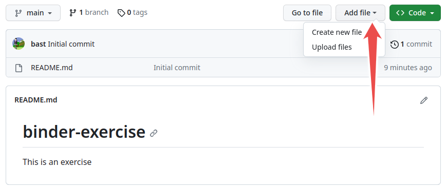
Create a new GitHub repository and click on “Add a README file”: https://github.com/new
This exercise can be done entirely through the GitHub web interface (but using the terminal is of course also OK). You can use the “Add file” button to upload files:
Screenshot of Binder web interface.
Upload the notebook which we have created earlier to this repository. If you got stuck earlier, you can download this notebook (right-click, “Save as …”). You can also try this with a different notebook.
Add also a
requirements.txtfile which contains (adapt this if your notebook has other dependencies):matplotlib==3.4.1
This exercise is for those who use Rmd files instead of Jupyter notebooks.
Upload or push your Rmd file to this GitHub repository.
Add a file
runtime.txtwhich specifies the R version you want to use:r-3.6-2020-10-13
Add a file
install.Rwhich lists the dependencies, for instance:install.packages(c("readr", "ggplot2"))
After you have done that, visit https://mybinder.org/v2/gh/USER/REPOSITORY/BRANCH?urlpath=rstudio (adapt “USER”, “REPOSITORY”, and “BRANCH”).
For more information, see this guide.
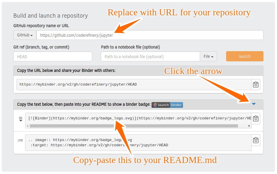
Visit https://mybinder.org:
Screenshot of Binder web interface.
Copy-paste the markdown text for the mybinder badge into a README.md file in your notebook repository.
Check that your notebook repository now has a “launch binder” badge in your
README.mdfile on GitHub.Try clicking the button and see how your repository is launched on Binder (can take a minute or two). Your notebooks can now be expored and executed in the cloud.
Enjoy being fully reproducible! Even better would be to get a DOI to your notebook and point Binder to the DOI.
(Optional) Exercise: what happens without requirements.txt?
Let’s look at the same activity inequality repository.
Start the repository in Binder using this link.
fig3/fig3bc.ipynbis a Python notebook, so it works in Binder. Most others are in R, which also works in Binder. But how?Try to run the notebook. What happens?
Most likely the run breaks down immediately in the first cell:
%matplotlib inline
import pandas as pd
import matplotlib.pyplot as plt
import seaborn as sns
sns.set(style="whitegrid")
from itertools import cycle
We get a long list of
ModuleNotFoundErrormessages. This is because the required Python packages have not been installed and can not be imported. The missing packages include, at least,pandasandmatplotlibmentioned in the error message.To install the missing requirements, add a new code cell to the beginning of the notebook with the contents
!python3 -m pip install pandas matplotlib
and run the notebook again. What happens now?
Again, the run breaks due to missing packages. This time the culprit is the
seabornpackage. Modify the first cell to also install it with!python3 -m pip install pandas matplotlib seaborn
and try to run the notebook for the third time. Does it finally work? What could have been done differently by the developer?
A good way to make a notebook more usable is to create a
requirements.txtfile containing the necessary packages to run the notebook and add it next to the notebook in the repository.In this case, the
requirements.txtcould look like thispandas matplotlib seaborn
and to make sure the packages are installed, one could add a code cell to the beginning of original notebook with the line:
!python3 -m pip install -r requirements.txt
To make sure that the notebook will continue to work also in few months, you might want to specify also the version in the
requirements.txtfile.
Shell commands, magics and widgets
A few useful magic commands
Using the computing-pi notebook, practice using a few magic commands. Remember that cell magics need to be on the first line of the cell.
In the cell with the for-loop over
num_points(throwing darts), add the%%timeitcell magic and run the cell.In the same cell, try instead the
%%pruncell profiling magic.Try introducing a bug in the code (e.g., use an incorrect variable name:
points.append((x, y2, True)))run the cell
after the exception occurs, run the
%debugmagic in a new cell to enter an interactive debuggertype
hfor a help menu, andhelp <keyword>for help on keywordtype
p xto print the value ofxexit the debugger by typing
q
Have a look at the output of
%lsmagic, and use a question mark and double question mark to see help for a magic command that raises your interest.
Examples of Jupyter features
Cell profiling
This exercise is about cell profiling, but you will get practice in working with magics and cells.
Copy-paste the following code into a cell:
import numpy as np
import matplotlib.pyplot as plt

def step():
    import random
    return 1. if random.random() > .5 else -1.

def walk(n):
    x = np.zeros(n)
    dx = 1. / n
    for i in range(n - 1):
        x_new = x[i] + dx * step()
        if x_new > 5e-3:
            x[i + 1] = 0.
        else:
            x[i + 1] = x_new
    return x

n = 100000
x = walk(n)
Split up the functions over 4 cells (either via Edit menu or keyboard shortcut
Ctrl-Shift-minus).Plot the random walk trajectory using
plt.plot(x).Time the execution of
walk()with a line magic.Run the prun cell profiler.
Can you spot a little mistake which is slowing down the code?
In the next exercise you will install a line profiler which will more easily expose the performance mistake.
Solution
Split the code over multiple cells (e.g. using Ctrl-Shift-minus)
import numpy as np
def step():
    import random
    return 1. if random.random() > .5 else -1.
def walk(n):
    x = np.zeros(n)
    dx = 1. / n
    for i in range(n - 1):
        x_new = x[i] + dx * step()
        if x_new > 5e-3:
            x[i + 1] = 0.
        else:
            x[i + 1] = x_new
    return x
Initialize n and call walk():
n = 100000
x = walk(n)
Plot the random walk
import matplotlib.pyplot as plt
plt.plot(x);
Time the execution using the %timeit line magic, and capture the output:
t1 = %timeit -o walk(n)
Best result
t1.best
Run with the %%prun cell profiler
%%prun
walk(n)
Installing a magic command for line profiling
Magics can be installed using pip and loaded like plugins using the
%load_ext magic. You will now install a line-profiler to get more
detailed profile, and hopefully find insight to speed up the code
from the previous exercise.
If you haven’t solved the previous exercise, copy paste the following code into a cell and run it:
import numpy as np
import matplotlib.pyplot as plt

def step():
    import random
    return 1. if random.random() > .5 else -1.

def walk(n):
    x = np.zeros(n)
    dx = 1. / n
    for i in range(n - 1):
        x_new = x[i] + dx * step()
        if x_new > 5e-3:
            x[i + 1] = 0.
        else:
            x[i + 1] = x_new
    return x

n = 100000
x = walk(n)
Then install the line profiler using
!pip install line_profiler.Next load it using
%load_ext line_profiler.Have a look at the new magic command that has been enabled with
%lprun?In a new cell, run the line profiler on the
walkandstepfunctions in the way described on the help page.Inspect the output. Can you more easily see the mistake now?
Solution
Copy-paste the code into a cell
Install the line profiler
!pip install line_profiler
Load the IPython extension
%load_ext line_profiler
See help:
%lprun?
Use the line profiler on the walk function:
%lprun -f walk walk(10000)
Aha, most time is spent on the line calling the step() function.
Run line profiler on step:
%lprun -f step walk(10000)
...
     8                                           def step():
     9      9999       7488.0      0.7     52.3      import random
    10      9999       6840.0      0.7     47.7      return 1. if random.random()
...
Aha! Lot’s of time is spent on importing the random module inside the step function
which is called thousands of times. Move the import statement to outside the function!
Data analysis with pandas dataframes
Data science and data analysis are key use cases of Jupyter. In this
exercise you will familiarize yourself with dataframes and various
inbuilt analysis methods in the high-level pandas data exploration
library. A dataset containing information on Nobel prizes will be viewed with the file browser.
Start by navigating in the File Browser to the
data/subfolder, and double-click on thenobels.csvdataset. This will open JupyterLab’s inbuilt data browser.Have a look at the data, column names, etc.
In a your own notebook, import the
pandasmodule and load the dataset into a dataframe:
import pandas as pd
nobel = pd.read_csv("data/nobels.csv")
The “share” column of the dataframe contains the number of Nobel recipients that shared the prize. Have a look at the statistics of this column using
nobel["share"].describe()
The
describe()method is smart about data types. Try this:
nobel["bornCountryCode"].describe()
- What country has received the largest number of Nobel prizes, and how many?
- How many countries are represented in the dataset?
Now analyze the age of prize recipients. You first need to convert the “born” column to datetime format:
nobel["born"] = pd.to_datetime(nobel["born"],
                               errors ='coerce')
Next subtract the birth date from the year of receiving the prize and insert it into a new column “age”:
nobel["age"] = nobel["year"] - nobel["born"].dt.year
Now print the “surname” and “age” of first 10 entries using the
head()method.
Now plot results in two different ways:
nobel["age"].plot.hist(bins=[20,30,40,50,60,70,80,90,100], alpha=0.6);
nobel.boxplot(column="age", by="category")
Which Nobel laureates have been Swedish? See if you can use the
nobel.loc[CONDITION]statement to extract the relevant rows from thenobeldataframe using the appropriate condition.Finally, try the powerful
groupby()method to analyze the number of Nobel prizes per country, and visualize it with the high-levelseabornplotting library.
First add a column “number” to the
nobeldataframe containing 1’s (to enable the counting below).Then extract any 4 countries (replace below) and create a subset of the dataframe:
countries = np.array([COUNTRY1, COUNTRY2, COUNTRY3, COUNTRY4])
nobel2 = nobel.loc[nobel['bornCountry'].isin(countries)]
Next use
groupby()andsum(), and inspect the resulting dataframe:
nobels_by_country = nobel2.groupby(['bornCountry',"category"], sort=True).sum()
Next use the
pivot_tablemethod to reshape the dataframe to a spreadsheet-like structure, and display the result:
table = nobel2.pivot_table(values="number", index="bornCountry", columns="category", aggfunc=np.sum)
Finally visualize using a heatmap:
import seaborn as sns
sns.heatmap(table,linewidths=.5);
Have a look at the help page for
sns.heatmapand see if you can find an input parameter which annotates each cell in the plot with the count number.
Solution
import numpy as np
import pandas as pd
nobel = pd.read_csv("data/nobels.csv")
nobel["share"].describe()
nobel["bornCountryCode"].describe()
USA has received 275 prizes.
76 countries have received at least one prize.
nobel["born"] = pd.to_datetime(nobel["born"], errors ='coerce')
Add column
nobel["age"] = nobel["year"] - nobel["born"].dt.year
Print surname and age
nobel[["surname","age"]].head(10)
nobel["age"].plot.hist(bins=[20,30,40,50,60,70,80,90,100],alpha=0.6);
nobel.boxplot(column="age", by="category")
Which Nobel laureates have been Swedish?
nobel.loc[nobel["bornCountry"] == "Sweden"]
Finally, try the powerful groupby() method.
Add extra column with number of Nobel prizes per row (needed for statistics)
nobel["number"] = 1.0
Pick a few countries to analyze further
countries = np.array(["Sweden", "United Kingdom", "France", "Denmark"])
nobel2 = nobel.loc[nobel['bornCountry'].isin(countries)]
table = nobel2.pivot_table(values="number", index="bornCountry",
                           columns="category", aggfunc=np.sum)
table
import seaborn as sns
sns.heatmap(table,linewidths=.5, annot=True);
Defining your own custom magic command
It is possible to create new magic commands using the @register_cell_magic decorator from the IPython.core library. Here you will create a cell magic command that compiles C++ code and executes it.
This exercise requires that you have the GNU g++ compiler installed on your computer.
This example has been adapted from the IPython Minibook, by Cyrille Rossant, Packt Publishing, 2015.
First import
register_cell_magic
from IPython.core.magic import register_cell_magic
Next copy-paste the following code into a cell, and execute it to register the new cell magic command:
@register_cell_magic
def cpp(line, cell):
    """Compile, execute C++ code, and return the standard output."""

    # We first retrieve the current IPython interpreter instance.
    ip = get_ipython()
    # We define the source and executable filenames.
    source_filename = '_temp.cpp'
    program_filename = '_temp'
    # We write the code to the C++ file.
    with open(source_filename, 'w') as f:
        f.write(cell)
    # We compile the C++ code into an executable.
    compile = ip.getoutput("g++ {0:s} -o {1:s}".format(
        source_filename, program_filename))
    # We execute the executable and return the output.
    output = ip.getoutput('./{0:s}'.format(program_filename))
    print('\n'.join(output))
You can now start using the magic using
%%cpp.
Write some C++ code into a cell and try executing it.
To be able to use the magic in another notebook, you need to add the following function at the end and then write the cell to a file in your PYTHONPATH. If the file is called
cpp_ext.py, you can then load it by%load_ext cpp_ext.
def load_ipython_extension(ipython):
    ipython.register_magic_function(cpp,'cell')
Solution
from IPython.core.magic import register_cell_magic
Add load_ipython_extension function, and write cell to file called cpp_ext.py:
%%writefile cpp_ext.py
def cpp(line, cell):
    """Compile, execute C++ code, and return the standard output."""

    # We first retrieve the current IPython interpreter instance.
    ip = get_ipython()
    # We define the source and executable filenames.
    source_filename = '_temp.cpp'
    program_filename = '_temp'
    # We write the code to the C++ file.
    with open(source_filename, 'w') as f:
        f.write(cell)
    # We compile the C++ code into an executable.
    compile = ip.getoutput("g++ {0:s} -o {1:s}".format(
        source_filename, program_filename))
    # We execute the executable and return the output.
    output = ip.getoutput('./{0:s}'.format(program_filename))
    print('\n'.join(output))

def load_ipython_extension(ipython):
    ipython.register_magic_function(cpp,'cell')
Load extension:
%load_ext cpp_ext
Get help on the cpp magic:
%%cpp?
Hello World program in C++
%%cpp
#include <iostream>
using namespace std;

int main()
{
    cout << "Hello, World!";
    return 0;
}
Parallel Python with ipyparallel
Traditionally, Python is considered to not support parallel programming very well (see “GIL”), and “proper” parallel programming should be left to “heavy-duty” languages like Fortran or C/C++ where OpenMP and MPI can be utilised.
However, IPython now supports many different styles of parallelism which
can be useful to researchers. In particular, ipyparallel enables all
types of parallel applications to be developed, executed, debugged, and
monitored interactively. Possible use cases of ipyparallel include:
Quickly parallelize algorithms that are embarrassingly parallel using a number of simple approaches.
Run a set of tasks on a set of CPUs using dynamic load balancing.
Develop, test and debug new parallel algorithms (that may use MPI) interactively.
Analyze and visualize large datasets (that could be remote and/or distributed) interactively using IPython
This exercise is just to get started, for a thorough treatment see the official documentation and this detailed tutorial.
First install
ipyparallelusingcondaorpip. Open a terminal window inside JupyterLab and do the installation.After installing
ipyparallel, you need to start an “IPython cluster”. Do this in the terminal withipcluster start.Then import
ipyparallelin your notebook, initialize aClientinstance, and create DirectView object for direct execution on the engines:
import ipyparallel as ipp
client = ipp.Client()
print("Number of ipyparallel engines:", len(client.ids))
dview = client[:]
You have now started the parallel engines. To run something simple on each one of them, try the
apply_sync()method:
dview.apply_sync(lambda : "Hello, World")
A serial evaluation of squares of integers can be seen in the code snippet below.
serial_result = list(map(lambda x:x**2, range(30)))
Convert this to a parallel calculation on the engines using the
map_sync()method of the DirectView instance. Time both serial and parallel versions using%%timeit -n 1.
You will now parallelize the evaluation of pi using a Monte Carlo method. First load modules, and export the
randommodule to the engines:
from random import random
from math import pi
dview['random'] = random
Then execute the following code in a cell. The function mcpi is a Monte
Carlo method to calculate $\pi$. Time the execution of this function using
%timeit -n 1 and a sample size of 10 million (int(1e7)).
def mcpi(nsamples):
    s = 0
    for i in range(nsamples):
        x = random()
        y = random()
        if x*x + y*y <= 1:
            s+=1
    return 4.*s/nsamples
Now take the incomplete function below which takes a DirectView object
and a number of samples, divides the number of samples between the engines,
and calls mcpi() with a subset of the samples on each engine. Complete
the function (by replacing the ____ fields), call it with $10^7$ samples,
time it and compare with the serial call to mcpi().
def multi_mcpi(dview, nsamples):
    # get total number target engines
    p = len(____.targets)
    if nsamples % p:
        # ensure even divisibility
        nsamples += p - (nsamples%p)

    subsamples = ____//p

    ar = view.apply(mcpi, ____)
    return sum(ar)/____
Final note: While parallelizing Python code is often worth it, there are other ways to get higher performance out of Python code. In particular, fast numerical packages like Numpy should be used, and significant speedup can be obtained with just-in-time compilation with Numba and/or C-extensions from Cython.
Solution
Open terminal, run ipcluster start and wait a few seconds for the engines to start.
Import module, create client and DirectView object:
import ipyparallel as ipp
client = ipp.Client()
dview = client[:]
dview
<DirectView [0, 1, 2, 3]>
Time the serial evaluation of the squaring lambda function:
%%timeit -n 1
serial_result = list(map(lambda x:x**2, range(30)))
Use the map_sync method of the DirectView instance:
%%timeit -n 1
parallel_result = list(dview.map_sync(lambda x:x**2, range(30)))
There probably won’t be any speedup due to the communication overhead.
Focus instead on computing pi. Import modules, export random module to engines:
from random import random
from math import pi
dview['random'] = random
def mcpi(nsamples):
    s = 0
    for i in range(nsamples):
        x = random()
        y = random()
        if x*x + y*y <= 1:
            s+=1
    return 4.*s/nsamples
%%timeit -n 1
mcpi(int(1e7))
3.05 s ± 97.1 ms per loop (mean ± std. dev. of 7 runs, 1 loop each)
Function for splitting up the samples and dispatching the chunks to the engines:
def multi_mcpi(view, nsamples):
    p = len(view.targets)
    if nsamples % p:
        # ensure even divisibility
        nsamples += p - (nsamples%p)

    subsamples = nsamples//p

    ar = view.apply(mcpi, subsamples)
    return sum(ar)/p
%%timeit -n 1
multi_mcpi(dview, int(1e7))
1.71 s ± 30.4 ms per loop (mean ± std. dev. of 7 runs, 1 loop each)
Some speedup is seen!
Mixing Python and R
Your goal now is to define a pandas dataframe, and pass it into an R cell and plot it with an R plotting library.
First you need to install the necessary packages:
!conda install -c r r-essentials
!conda install -y rpy2
To run R from the Python kernel we need to load the rpy2 extension:
%load_ext rpy2.ipython
Run the following code in a code cell and plot it with the basic plot method of pandas dataframes:
import pandas as pd
df = pd.DataFrame({
    'cups_of_coffee': [0, 1, 2, 3, 4, 5, 6, 7, 8, 9],
    'productivity': [2, 5, 6, 8, 9, 8, 0, 1, 0, -1]
})
Now take the following R code, and use the
%%Rmagic command to pass in and plot the pandas dataframe defined above (to find out how, use%%R?):
library(ggplot2)
ggplot(df, aes(x=cups_of_coffee, y=productivity)) + geom_line()
Play around with the flags for height, width, units and resolution to get a good looking graph.
Solution
import pandas as pd
df = pd.DataFrame({
 'cups_of_coffee': [0, 1, 2, 3, 4, 5, 6, 7, 8, 9],
 'productivity': [2, 5, 6, 8, 9, 8, 0, 1, 0, -1]
})
%load_ext rpy2.ipython
%%R -i df -w 6 -h 4 --units cm -r 200
# the first line says 'import df and make default figure size 5 by 5 inches
# with resolution 200. You can change the units to px, cm, etc. as you wish.
library(ggplot2)
ggplot(df, aes(x=cups_of_coffee, y=productivity)) + geom_line();